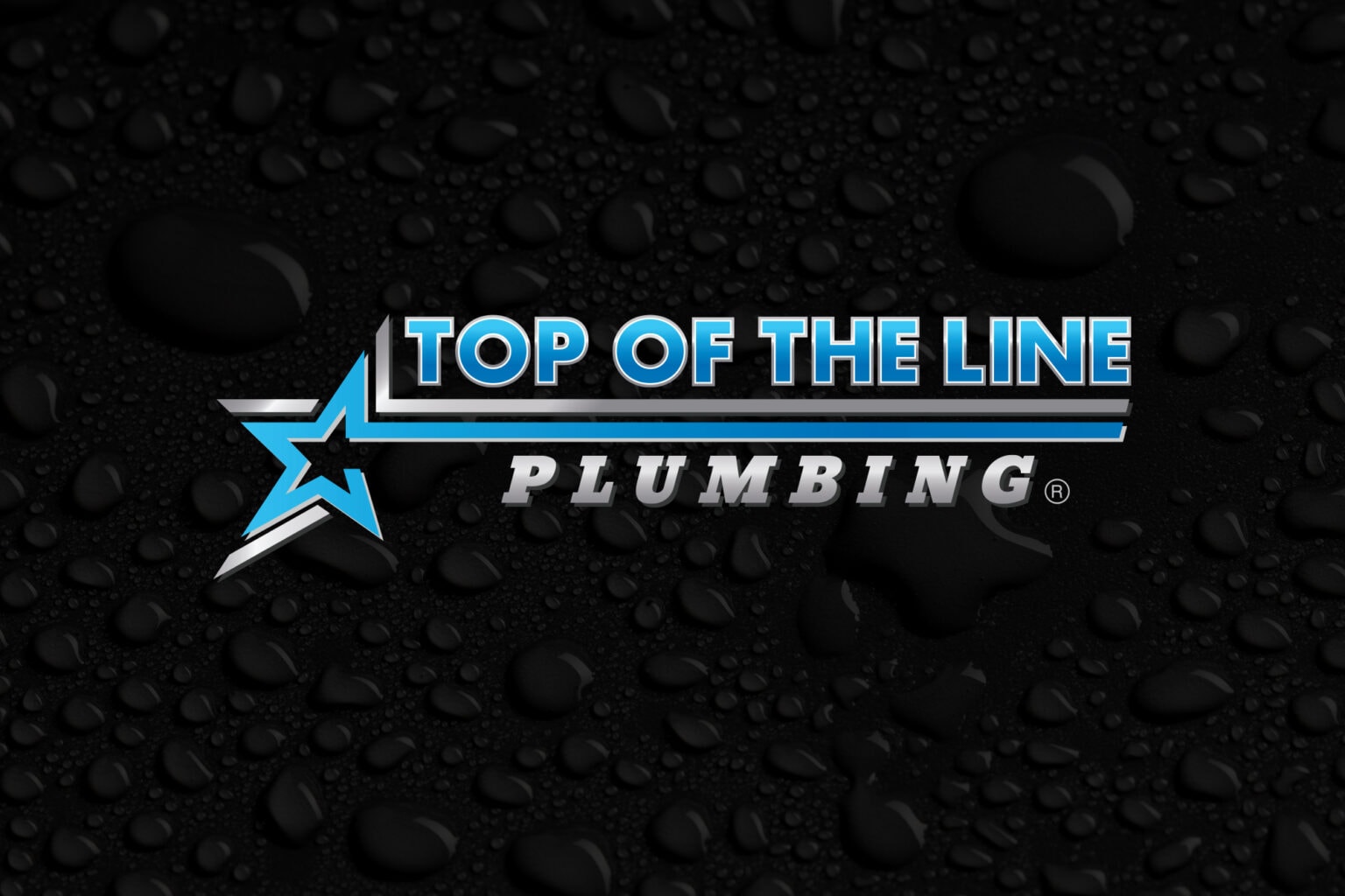
The Top of the Line Plumbing logo design was made with the imagery of clean plumbing in mind, including steel texture. The logo incorporates a mix of dynamic elements to create a logo with a lot of visual contrast that creates intrigue and really lets the text and symbol pop. This was achieved by subtle uses of drop shadows which gave the logo dimension and allowed for a further sense of depth.
The colors were chosen to represent elements often associated with plumbing and cleaning. The greyscale gradient symbolizes the steel of the pipelines that need repairing and the blue represents the clean flowing water and drain cleaning solutions. The star features a star which is indicative of a premium experience. One of the arches extends throughout the headings, acting as a separator and a visual representation of water flowing effortlessly through the pipelines. The Top of the Line Plumbing logo design succeeds in modernizing the brand’s image and giving the impression that they will receive a quality experience that will provide restoration of any plumbing issue and peace of mind.
In addition to the logo design, we have also designed flyers, business cards, and website.
BELOW ARE SOME OF THE ALTERNATE LOGOS WE DESIGNED.


