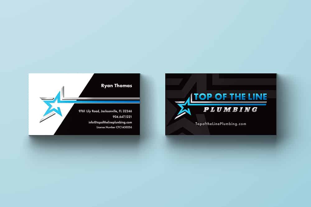
The Top of the Line Plumbing Business Card Design uses the logo’s composition to form a clear structure as well as create more cohesion throughout the brand. The hierarchy of text is immediately recognizable as the logo continues to act as a separator between the headers and sub headers. Another separator was included on the back adjacent to one of the angles of the star, further organizing the visual elements and the important text.
The color logo works very well against both white and black backgrounds due to its primarily midlevel color tones. To give the front of the card more interest, our designers added an offset, low opacity blown-up version of the logo shape to the dark background. The Top of the Line Plumbing Business Card Design provides a sleek look to the brand and will prove to be an attractive piece of collateral to share and spread the word about the company.
In addition to the business card design, we have also designed flyers, website, and logo. We’ve also worked on business card designs such as the Jets Business Card Design and the myQRad Business Card Design.

