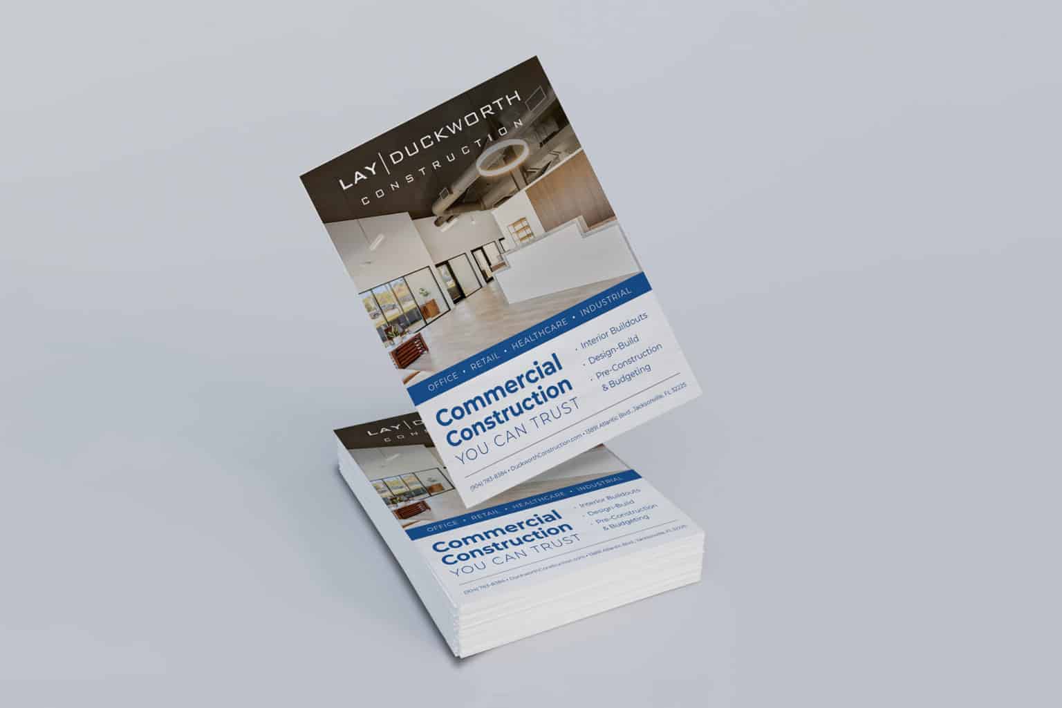
Lay|Duckworth Construction is a commercial renovation company based in Northeast Florida with a precise branding style. The Lay|Duckworth Jax Business Journal Ad Design uses the brand’s signature style to create a cohesive, sturdy design.
This ad uses photography and type hierarchy to showcase the company’s construction work. Two thirds of the ad demonstrate this with a photo that shows an interior they’ve worked on from top to bottom. This is able to to show a variety as well as the overall picture of the services they can provide during construction.
Type hierarchy plays a huge role in structuring the information and guiding the reader’s eyes from start to finish. The main headline uses a mix of bold and uppercase type at a large size to introduce the audience to the company’s area of expertise. The brand’s signature blue tone is used for dividing the photo and text as well as listing the main services that can be provided. Every necessary detail is able to be neatly organized in the bottom to match the inner width, including the contact information to bring more traffic directly to Lay|Duckworth.
The Lay|Duckworth Jax Business Journal Ad Design demonstrates a balanced hierarchy of information which allows the company’s professionalism to be put on full display. We’ve also worked on the the Fiorentino Group Florida Trend Ad Design and the Go Tuk’n Airport Ad Design.

