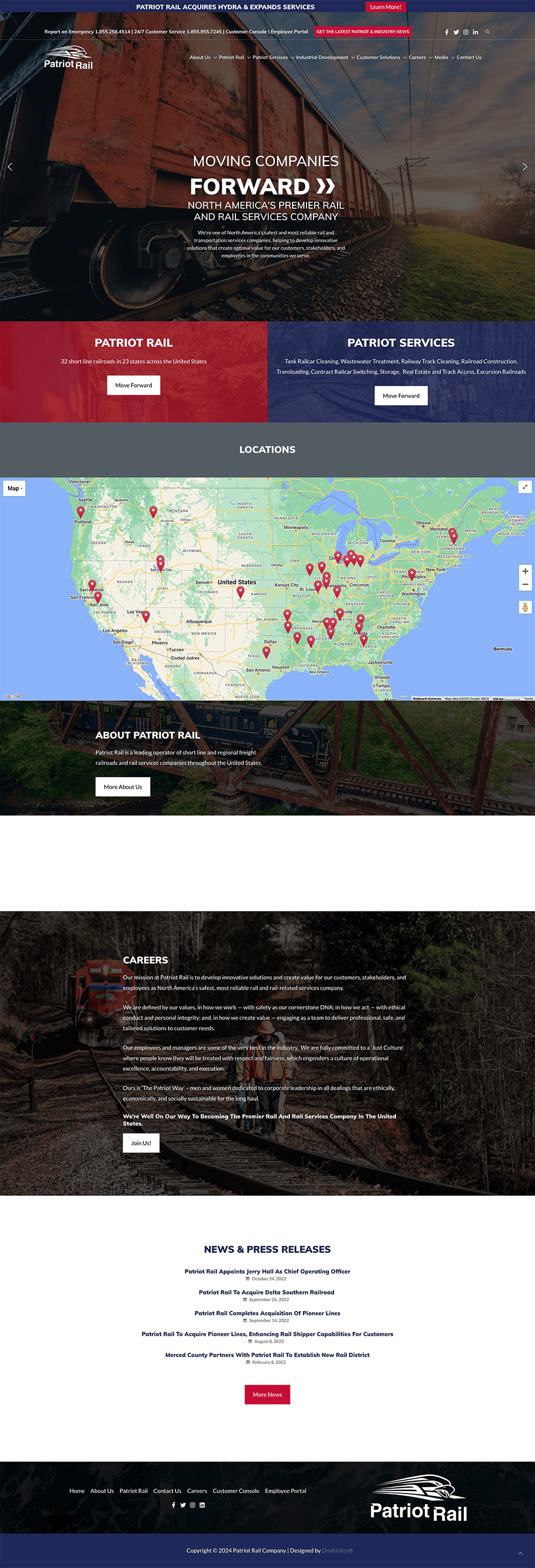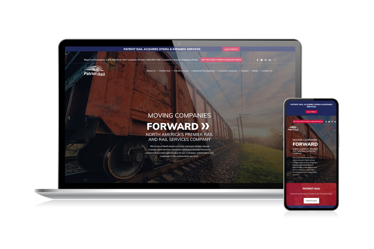
Patriot Rail & Ports is an expansive company responsible for a great span of railway and cargo coverage in the Southeast. A business of this scale requires a bold website that demonstrates the considerably large machinery they deal with. This was achieved through an almost cinematic approach showcasing imagery of these larger-than-life locomotives and ships. In direct contrast, large amounts of white space where used for text and list areas. This allows for a greater sense of balance when placed next to such grand photography.
The red, white, and blue color scheme serves an additional purpose to the American Patriot theme. It also allows the site to be better organized and separate sections through the use of high contrasting red and blue paired next to each other. The website overall uses a lot of square elements from the structuring to the type treatment. This was done in conjunction with the company’s message as square symbols often represent structure, stability, and balance. The Patriot Rail & Ports Website Design delivers a website that is easy to navigate thanks to its layout and clarity while demonstrating the strength and reliabilty clients can depend on from Patriot Rail & Ports.
View the full website at patriotrail.com