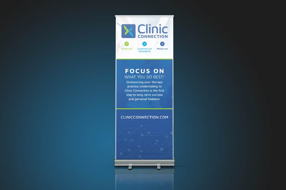
Clinic Connection is a company that allows therapists to easily connect with insurance companies and save time on the busy work of finding necessary documents. Doohickey created a set of tradeshow graphics such as this banner to demonstrate the company’s brand and message. The Clinic Connection Tradeshow Banner succeeds in delivering the company’s message to a wide tradeshow audience in a large yet compact format.
The large-format display of the Clinic Connection Tradeshow Banner gives a bold presence to the company’s promise to make meaningful for therapists. The angular design of the logo carries the visual aesthetics of the brand by using interconnected angle shapes as the overlay to the background image. The overlay uses the shape of the logo and zooms into the cross-section of the X shape to give the overlay a more dynamic feel as opposed to a solid blue overlay.
Photo images are used in the background to give the banner a better impression of how Clinic Connection can better serve their clients and bring their services to the real world. The theme of connection is further demonstrated in the grid graphic in the bottom section. This area containing the website provides clear space for the banner to ensure the core content stands out at the top while allowing the viewer’s eyes to have more free space once they have finished reading all the information.

