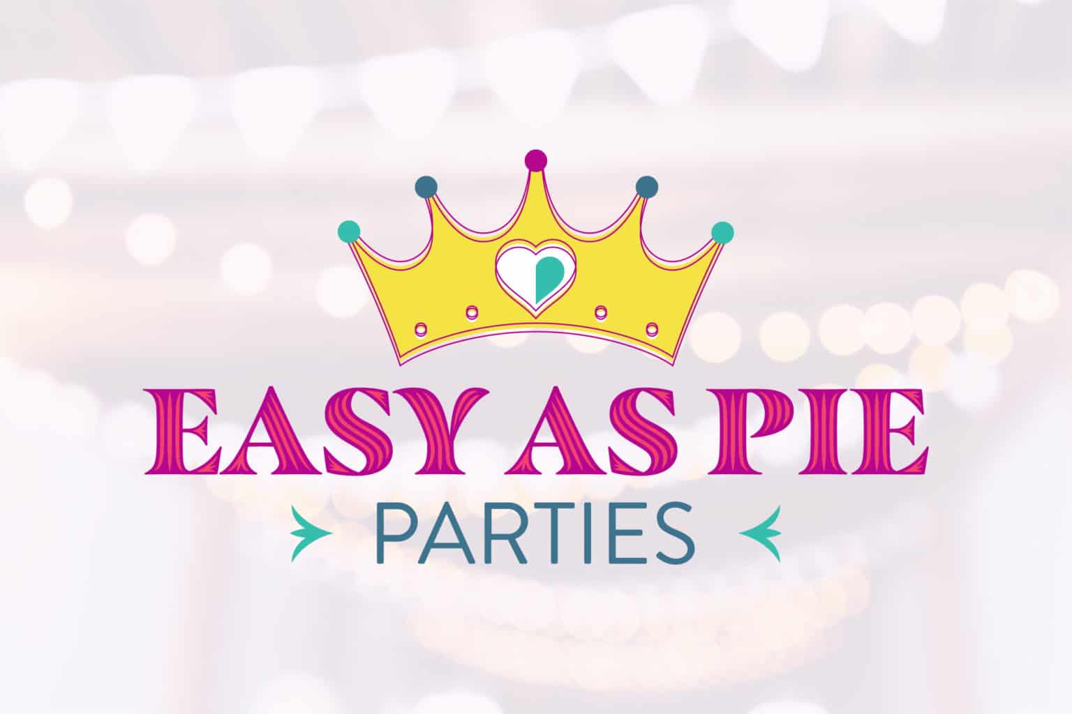
Easy as Pie Parties is a party company dedicated to supplying party goods for all kinds of events. The Easy as Pie Parties Logo Design features a retro crown with a Roaring 20’s design that appeals to all kinds of party goers.
Inspiration for the crown symbol comes from the client’s original vision. We wanted to expand upon the concept and make various crown designs that would suit audiences of all age ranges. Our final version gives the logo a lot of energy with the offset of pink outlines around the base of the crown. In addition, the center heart has a shaded effect to it to add to the logo’s 3D look.
We wanted to use fonts that give the logo a touch of luxury that compliments the crown icon. Masqualero Groove is an excellent choice for this type of logo as the main header. The negative space inside the grooves allows the logo to have two pink tones that compliment each other and make the header pop out.
The Easy as Pie Parties Logo Design lets itself shine with its retro influences and guarantees that for any celebration, it’s sure to be one that you won’t forget! Below are some previous logo designs. We’ve also worked on the Gauge Saver Logo Design and the STACK’M Storage Logo Design.


