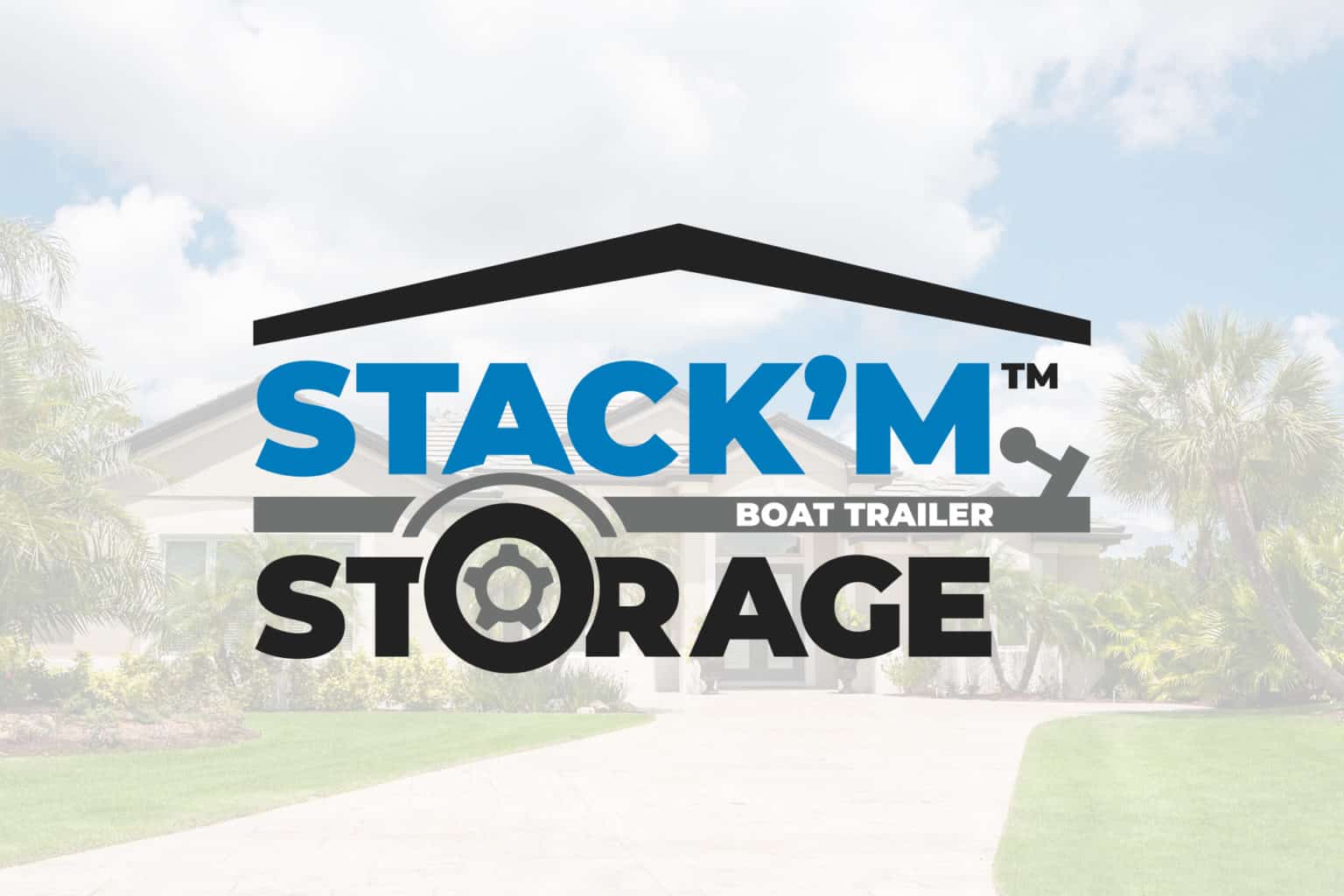
STACK’M Storage is a company that specializes in storing, repairing, and delivering boat trailers. With the STACK’M Storage Logo Design, the goal was to create visuals representing the recognizable parts of a boat trailer and simplifying them for a modern illustration design. All of the variations in the design process were made with sturdiness and stability in mind.
The core elements we wanted to demonstrate in the logo were the stacked trailers on top of each other being protected by a solid roof. Equipment like boat trailers can get damaged and rusted when exposed to outdoor elements, which is why STACK’M emphasizes a large indoor area dedicated to protecting boatloads of trailers. The boat trailer illustration doubles as a divider and a part of the text with the trailer’s wheel enlarged to fit nicely into the O of “STORAGE”.
Negative space plays a big role in the final design with the shapes being neatly cut out from elements like the wheel and arch. The rooftop visualizes the protection the trailers will receive under STACK’M Storage’s care. It extends to the full width of the logo, but the text does not. This was deliberate to keep the logo from being to bold and overbearing, and it was respectfully balanced by the ending notch of the trailer. This added another layer of structure to the design as well as conveying the shape of the boat trailer even more.
In addition to the logo, we also worked on the STACK’M Storage Website Design.
Below are some alternative designs for the STACK’M Storage Logo.


