Prime Roofing is dedicated to providing their clients with the most durable materials and roof designs. With the Prime Roofing Pocket Folder Design, we wanted to make a piece of collateral that was designed to reflect the sturdiness of the Prime Roofing experience.
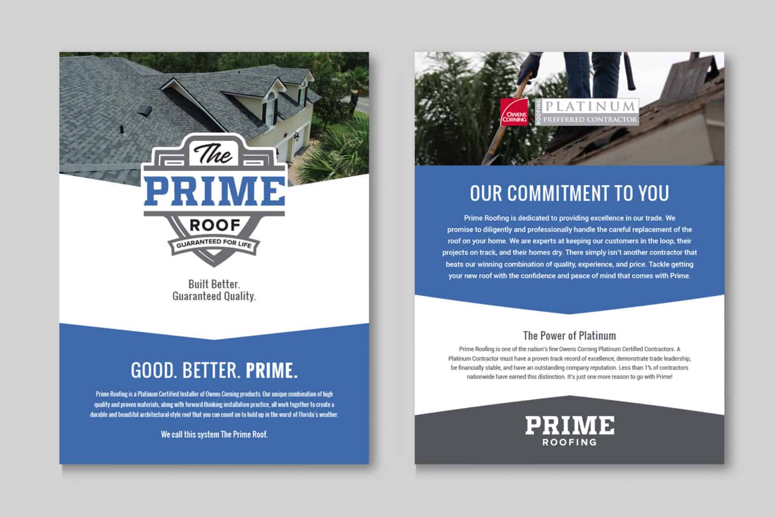
This particular brochure was made to reflect the strength in the brand by using bold design and incorporating the shield into the format. The curve of the shield divides the inner pages by pushing the photography back and focusing on the competitive parts of the business that give them the higher standard. Large sections of text are divided into wide blocks which falls inline with the bold designs of Prime Roofing. The royal saturated blue and shades of dark grey strike a color balance similar to the logo itself.
The use of typography in the Prime Roofing Pocket Folder Design was made to be dynamic with hierarchies of bold to thin and even different angles with the Higher Standard tagline. The shield was also incorporated in the main bullet points to emphasize their importance. The numbered shields are layered on top of the photography to make them pop out and catch the reader’s attention.
In addition, we also designed the Prime Roofing Trifold and the Prime Roofing Metal Brochure.