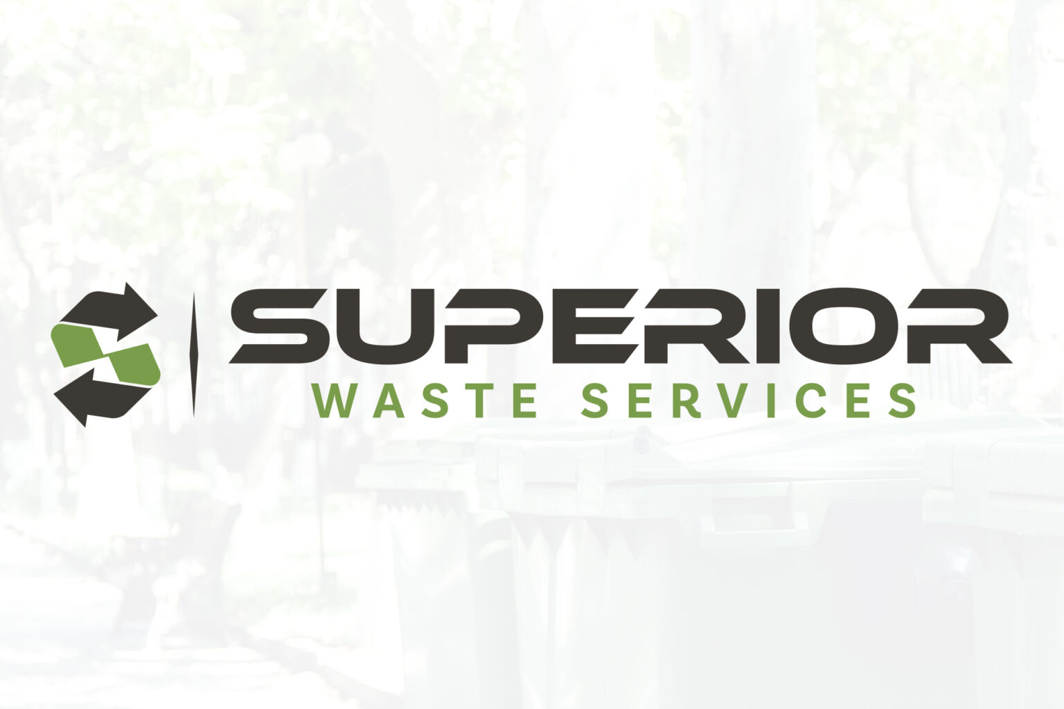
Superior Waste Services is a company dedicated to quality waste management, garbage disposal, and recycling. The Superior Waste Services Logo Design creates an impactful icon and font pairing for expert waste services.
This logo’s icon was inspired by recycling iconography with arrows pointing into each other to indicate reusing eco-friendly materials. Combining this with the S in Superior makes a unique symbol that distinguishes the brand as a premium service. This icon uses parallel lines in its geometry to give parts of the S a sense of alignment while also keeping it feeling organic. Both ends of the S having arrow heads allows the shape to indicate recycling like the standard recycling triangle.
The typography used in this design uses bold standard and italic fonts to create type contrast. The edges of “Superior” are stylized with slanted lines to add a unique characteristic to the company’s brand. It also helps complement the style of the icon that contains similar sharp edges. Superior Waste Services Logo Design delivers a distinctive logo showcasing the brands professionalism in waste disposal services.
We’ve also worked on the Immerse Studio Logo Design and the Get Volts® Logo Design. Other options we created for the Superior Waste Services:


