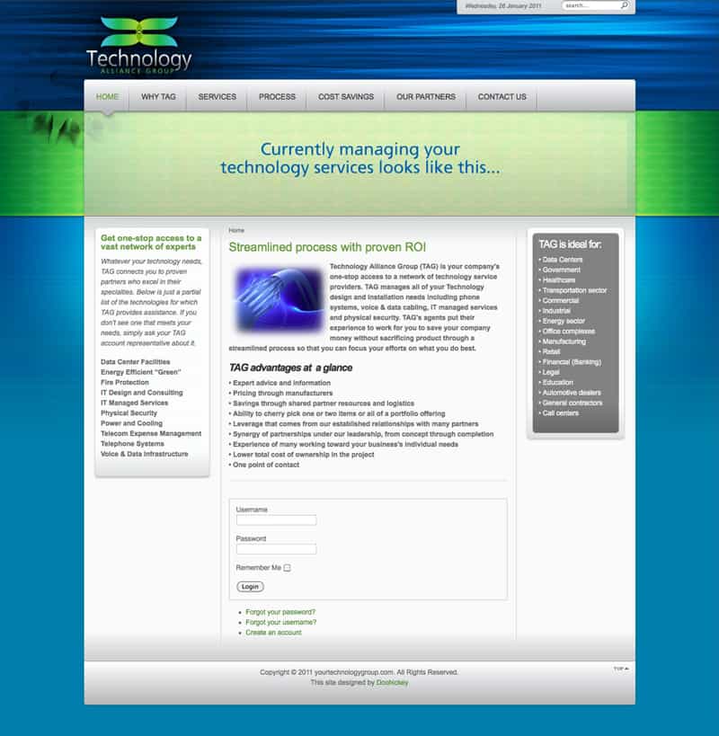
The Technology Alliance Group website design features a clean and organized design that was developed with user experience in mind. For a content-heavy website, we wanted to ensure that the information flowed from one web page to the next. We also separated the content into different pages, so users could find what they’re searching for without confusion or hassle. The resulting Technology Alliance Group website design is orderly and detailed.
We also featured the Technology Alliance Group color scheme throughout the design, allowing the vibrant blue and green to give the website a pop of color. By using the company’s color scheme, we’re able to keep the brand identity cohesive throughout their marketing materials. As a result, clients are more likely to recognize the company by their brand.
In addition to the Technology Alliance Group logo design, Doohickey also created the company logo. We’ve also worked on website designs such as the Fiorentino Group Website Design and the Burgos Group Website Design.

