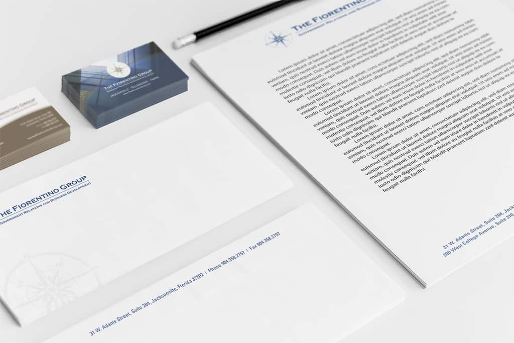
The Fiorentino Group stationery design was inspired by the company’s professional, modern atmosphere. Using the compass emblem as a central creative element throughout the materials allows them to coexist with a cohesive design. The company logo speaks for itself, and combined with the company color scheme, the Fiorentino Group brand is at the forefront of these marketing materials.
The Fiorentino Group and Doohickey partnered to create a unique stationery design. A successful stationery design is key in developing the base of a company’s identity. It provides potential and current clients with a snapshot of who you are and how you want to be seen. As a government relations and business development firm, the Fiorentino Group can be viewed as both traditional and progressive, and they needed a stationery design to fit that description.
The Fiorentino Group is a government relations firm that offers a variety of services to influence public policy. They work alongside clients to develop custom strategies aimed towards achieving successful outcomes. In addition to planning and implementing these strategies, The Fiorentino Group also builds coalitions, provides analysis of the political atmosphere, and identifies opportunities to obtain their customers’ goals.
As part of a branding initiative, Doohickey carried these design concepts over when creating The Fiorentino Group’s brochures, greeting cards, and website.

