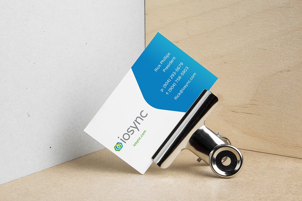
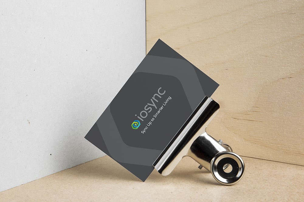
Once we created the company’s logo and website, we developed the IOSync business card design to help our client market their business. This design leverages the green, blue, and gray color scheme we originally developed for the logo, allowing us to pull on a brand identity for a cohesive design. The overlapping geometric shapes within the logo symbolize the company’s smart home syncing technologies, which we used on the back of the card to tie the entire design together. As a result, the IOSync business card design leverage elements from other branding materials to help the company increase brand awareness with a recognizable visual brand.
IOSync offers multifamily housing, student housing, resorts, venues, and other communities the ability to sync up to smarter living. Their smart home services and products create efficient living environments so that property managers and residents can experience integrated lifestyles. With IOSync’s smart home solutions, communities and residents can step into the future and sync their lives to added security, convenience, and more.
In addition to the IOSync business card design, Doohickey also created the company’s website, logo, brochures, flyers, and pocket folders. By creating the IOSync logo design as the starting point for the brand, we were then able to display the logo, as well as an established color scheme, across these numerous marketing materials. The IOSync print campaign implements this cohesive brand, making it easier for existing and potential clients to recognize IOSync from a glance. By developing a strong visual brand, we’re also able to boost IOSync’s brand awareness in the market, making them more recognizable amongst their competitors.


