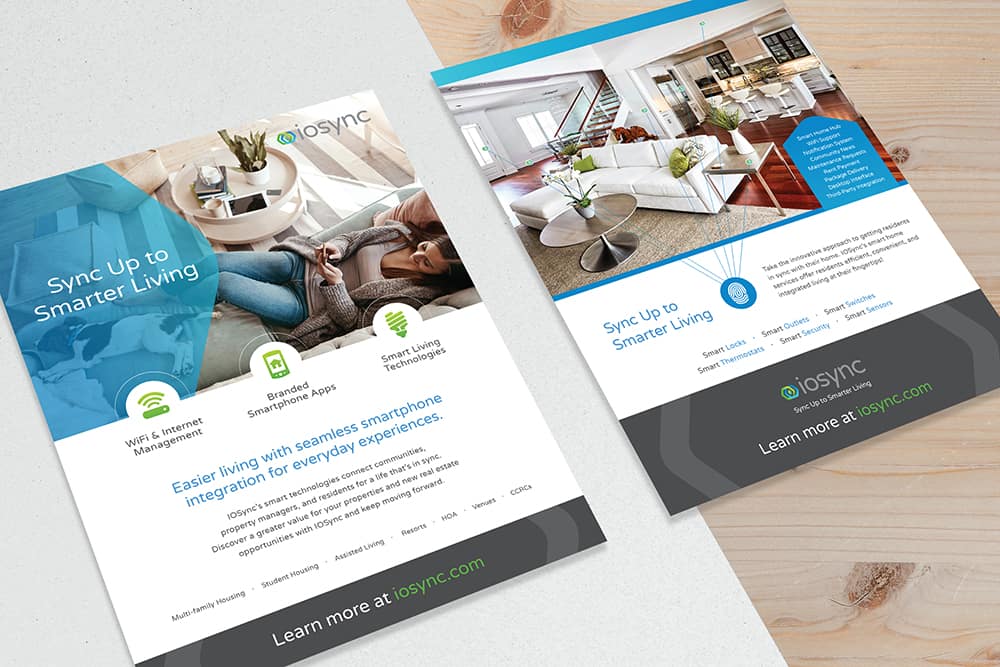
A marketing flyer is a creative and quick method to communicate a clear, concise message. For the IOSync flyer design, we implemented the brand identity we previously developed for the company, which includes an eye-catching color scheme, and used white space to draw the eyes towards specific pieces of information. This flyer also features the use of geometric shapes, which we pulled from the logo we created for the company, as well as icons, allowing us to communicate through a balance of text and visuals. The resulting IOSync flyer design is clean and vibrant, communicating the company’s services as part of the company’s overall marketing campaign.
IOSync offers multifamily housing, student housing, resorts, venues, and other communities the ability to sync up to smarter living. Their smart home services and products create efficient living environments so that property managers and residents can experience integrated lifestyles. With IOSync’s smart home solutions, communities and residents can step into the future and sync their lives to added security, convenience, and more.
In addition to the IOSync flyer design, Doohickey also created the company’s website, business cards, brochures, logo, and pocket folders. By creating the IOSync logo design as the starting point for the brand, we were then able to display the logo, as well as an established color scheme, across these numerous marketing materials. The IOSync print campaign implements this cohesive brand, making it easier for existing and potential clients to recognize IOSync from a glance. By developing a strong visual brand, we’re also able to boost IOSync’s brand awareness in the market, making them more recognizable amongst their competitors.

