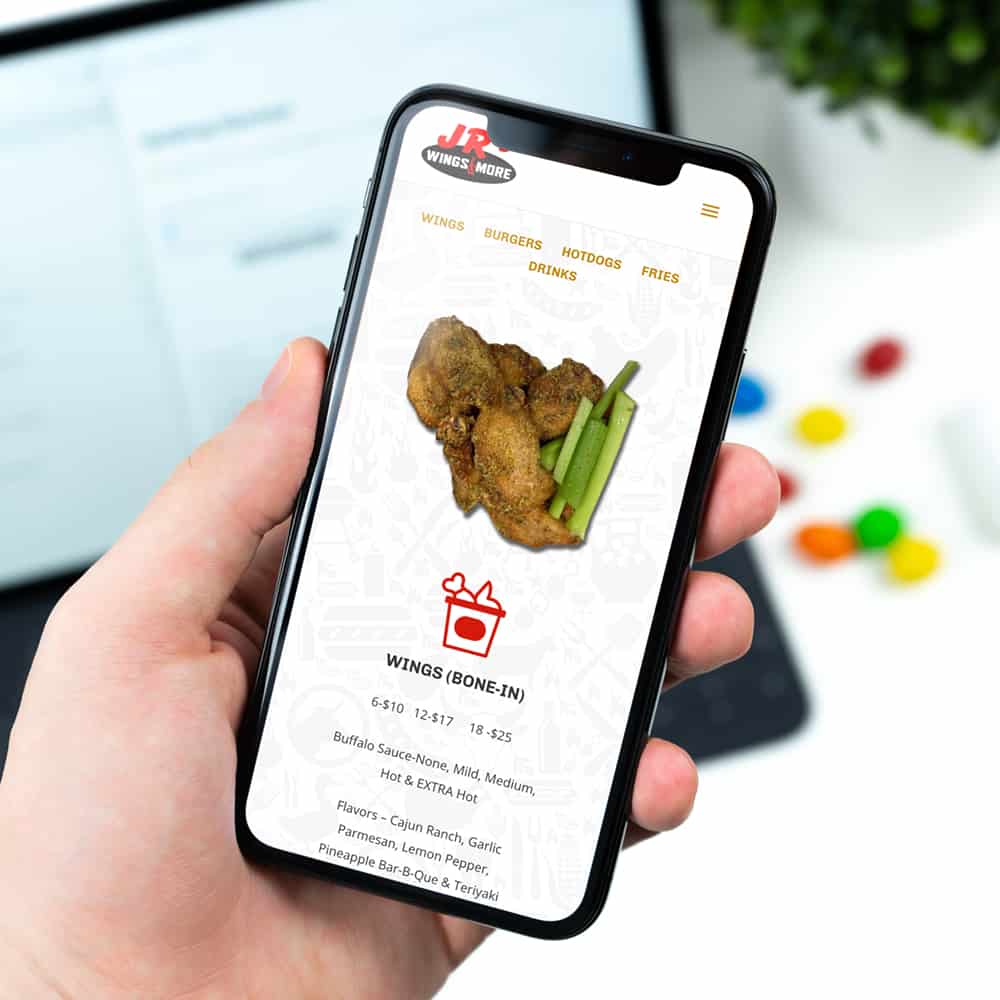
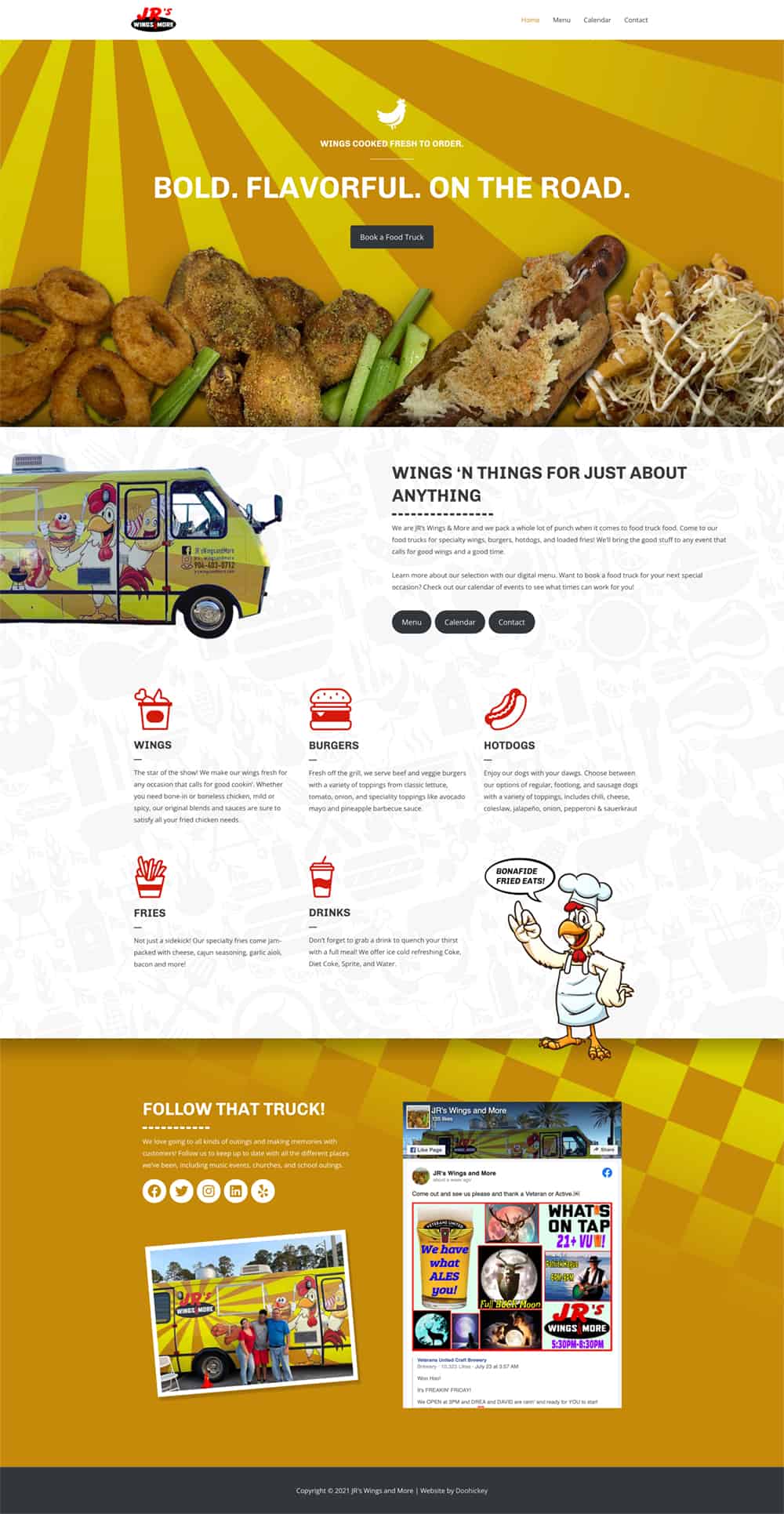
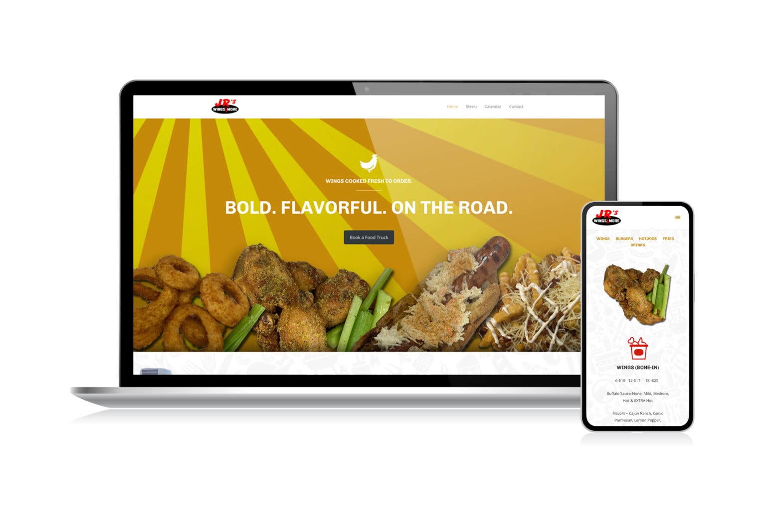
The goal for the JRS Wings & More Website Design was to make a website that was as exciting and delicious as the wings they make! It’s important to bring that excitement into the look of the website to reflect the fun events they’ll be catering for.
The initial look of the design was based on the illustrative look of the food truck itself. We used custom illustrations of the chicken character throughout the website to add more personality and highlight key points of information. The sunbeam pattern in the truck’s background is recreated in the home page’s hero image. This pattern also draws the viewer’s eye to pictures of their food. It’s important with any restaurant website to showcase visuals for the food and service. We did this through illustrations and photographs, making the menu easy to navigate with a set of icons of all the categories of items offered.
To add a feature unique to the website itself, a subtle background was added featuring dozens of illustrations of different cookout foods. This allows the more text heavy sections to still feel exciting without resorting to a plain white background. The JRS Wings & More Website Design sends the message that if you’re looking for fresh and fun catering at your next big event, JRS food truck is ready to roll out!
We’ve also worked on food related projects such as the TacoLu Logo Design and the Burger King Billboard Design.


