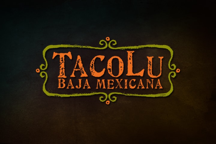
Since 2008, TacoLu has been a Jacksonville culinary hotspot. With festive sugar skulls and roses painted on the walls, multi-colored hot pepper lights hanging from above, and eclectic decorations on nearly every surface, TacoLu embodies culture in their atmosphere as well as their food. For the TacoLu logo design, Doohickey sought to capture the restaurant’s essence. To do so, we created a logo inspired by the Mexican culture and TacoLu’s unique environment.
We started with a textured font, directing focus straight towards the TacoLu name. We then added a playful border around the text, mimicking the textured lettering for a brush stroke appearance. The orange and green color scheme reflects the signature sugar skull seen at TacoLu’s entrance and speaks to the company’s vibrant, invigorating atmosphere.
What started as a little taco shack has since grown into a familiar Jacksonville eatery. Their menu includes salads, enchiladas, quesadillas, and (of course) tacos. Among their tacos, the Bangin’ Shrimp has become a fan favorite; so much so that the restaurant’s food truck was named after it! We wanted to create a logo that would embody the company for years to come, while remaining as distinctive as the Lu itself.
The TacoLu logo design was part of a larger branding initiative that included new menus and website design.

