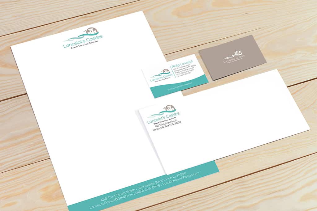
A first impression only happens once, but well-designed marketing materials can make a first impression that lasts. For Lancelot’s Castles stationery design, our primary goal was to provide impactful, enduring designs that reflected the company as a whole.
We started our designs by implementing the logo and color scheme we previously developed for Lancelot’s Castles on the materials. We created a set of business cards, letterhead, and envelopes, making alterations for each. On the bottom of the business cards, we mimicked the movement of the ocean found in their logo. We used the same shade at the bottom of their letterhead, allow us to tie the stationery materials together with the company’s unique brand style. Successful stationery and business card design are integral to any marketing strategy. With these designs, Lancelot’s Castles conveys the impression of a professional company to existing and potential customers.
Lancelot’s Castles specializes in providing a unique leasing and property management experience. They combine the essence of a relaxed beach lifestyle with their customers’ unmatched enthusiasm for finding or leasing the perfect property in Northeast Florida.
Doohickey developed Lancelot’s Castles stationery design as part of a larger branding initiative that included logo design, brochure design, website design, and social media advertising.

