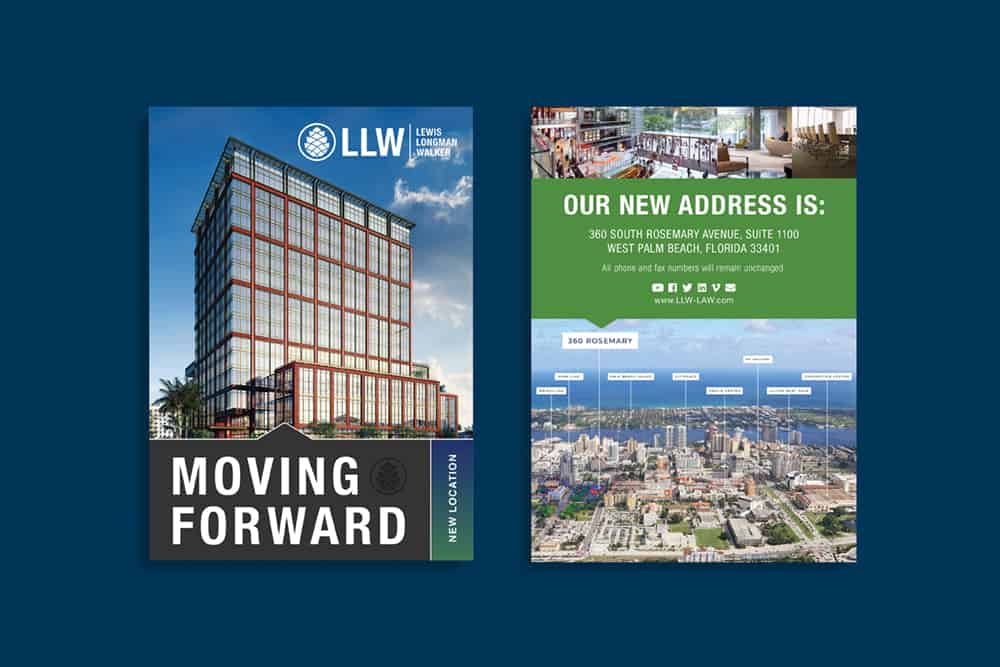
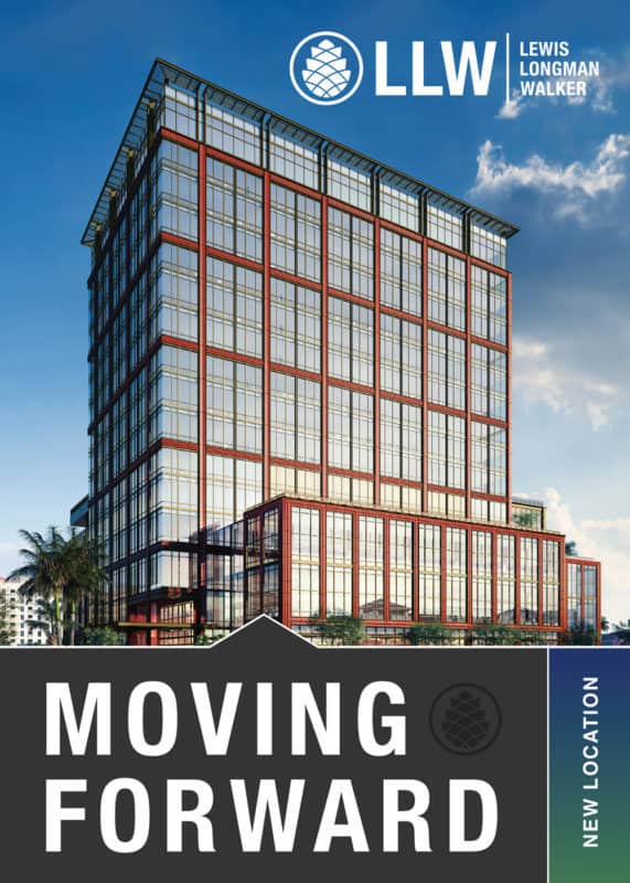
We love designing special flyers for big occasions! The LLW New Office Location Direct Mail Design uses stunning visuals and organized sections to inform readers of the company’s new location.
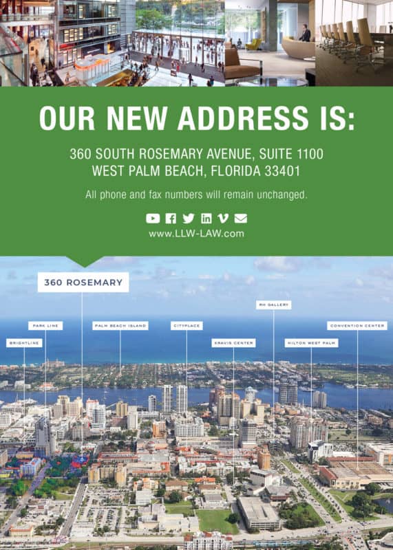
The composition of the building perfectly fits the front side of the flyer with similar clear space on each of the edges of the page. Boxed sections divide the photos and information with angled shape dividers to help guide the reader’s eye to specific locations. An aerial photo above West Palm showcases high production quality and gives a visual of where the location is relative to the surrounding area.
Interior shots are placed above the “Our New Address” section. This creates a dynamic layering effect that lets the reader view the inside, outside, and general surroundings of the new business location. Type hierarchy is used to create bold general headlines that grab the viewer’s attention and then work their way down into the more specific information. The direct mail design showcases the new business address in an impactful way that emphasizes the size and scale of the company.
In addition to the LLW New Office Location Direct Mail Design, we’ve also made numerous ads and invitations for Lewis Longman Walker.


