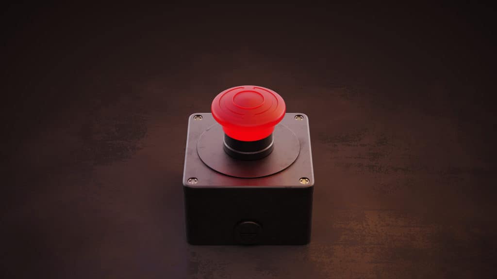
Have you ever noticed that T.V. and film trope where the device that could save the world has a big red button you just shouldn’t press? Of course, accidents happen, or the temptation is just too much, and our quirky hero just has to press it. Meanwhile, we—the audience—are left to wonder why that button even exists in the first place. The great graphic design CTA button debate poses the same question: Do we really need them?
Whether it’s on landing pages, digital ads, or emails, creating a CTA (call-to-action) button can be essential to raking in leads. However, are graphic design CTA buttons always necessary (in the case of our beloved superhero films, we’re going to say no)? We’ve broken down the Great Button Debate to compare the for’s and forgo’s for ourselves!
For
Is that big red button temptation just too much to ignore? Good—then customers won’t be able to resist, either. Here are five reasons to go for the graphic design CTA button in your content, so customers feel that click-click-click temptation, too!
Indicated Inspiration
If the goal of your landing pages, digital ads, emails, or other digital marketing materials is to incite action, a graphic design CTA button gives customers direction. After all, a call-to-action inspires action. A button indicates that specific activity, so customers know exactly where they’re headed.
Unique design components, such as hover animations or arrows that point to your CTA, can give buttons that added “oomph” to really get a wow from your customers. With a button designated for a specific action, you can inspire customers while keeping them focused on that specific end-game.
Eye-Catching Charisma
When a webpage or ad uses a white background and black text, your eyes are likely to zoom straight for that splash of color on the page. Using a colorful button that differentiates from the rest of the ad—otherwise known as the Isolation Effect—is an effective strategy for snagging your customers’ attention.
On e-commerce pages, where the goal is for customers to complete a purchase, red and orange are the way to go. According to graphic design color psychology, these two colors convey passion and urgency. A/B testing shows that these colors outperform others, which is likely why you see them used for sales so often.
A colorful button that contrasts with the surrounding material catches customers’ eyes and sparks that must-click compulsion.
Brief Bequests
While the CTA button indicates where customers can take action, the CTA text conveys what that action actually is. Though pressing a button can sometimes bring on the unexpected, customers are more likely to share in the excitement if they know what they’re getting into. “Schedule Today,” “Send Me Specials Now!,” and even theSkimm’s share button are specific enough to get customers moving into action!
Graphic design CTA buttons paired with action-driven language take the guesswork out of your marketing materials. No more monstrously unexpected detours.
Click Consistency
A familiar CTA button can also become a part of your brand. By using a quirky, recognizable CTA throughout various materials, you can leverage a content consistency marketing strategy that helps customers recognize you from the rest.
It All Clicks Into Place
These CTA button benefits all come together to offer customers what they want: ease and convenience. By directing customers to specific actions using a CTA button, you provide them with easy navigation and a gratifying user experience. No confusion, no hassle. There’s also a chance that the lack of a CTA button hinders customers from realizing your digital ad links to a landing page or form. As a result, you might lose the chance for conversions altogether.
Forgo
While there are numerous benefits to including a graphic design CTA button on your materials, there are a few reasons to go without a button, too (not including all of those ‘save the world’ situations, of course).
Button-less Breathing Space
CTA buttons are meant to be big and bold, so they stand out alongside featured content. Going without a button, however, gives more space for the rest of your ad. As a result, you can keep customers focused on other design components, including messaging and imagery, and allow the design to speak for itself.
Give Credit Where Clicks Are Due
For some digital ads, it’s implied that clicking the image will direct customers elsewhere. Give your customers a little credit; they’ve probably seen digital display ads before. Plus, high converting copywriting (see below) within your ad should speak to the action you want customers to take. As a result, a CTA button reiterating that action could become altogether irrelevant.
Don’t Button Up Creative Copy
CTA language doesn’t have to be blocked off or condensed to fit within the confines of a button. With high converting copywriting, marketing materials can inspire customers to take action without needing an actual button to provide direction.
Phrases like “Head Down the Rabbit Hole” give your CTA an adventurous edge, while “Don’t Click Here” challenges your more rebellious customers by playing off their curiosity. These CTAs don’t have to be blocked off. Instead, designers can use that freed-up, button-less breathing space to make these more playful CTAs part of the design.
Design That’s Cute As A Button
If your design materials are already imagery-heavy, a CTA button can actually disturb the design. That’s not cute; that’s just inconvenient. Instead of overcomplicating an already intricate design, removing the CTA button keeps customers focused on the content. As a result, you can keep the design clean and concise. Bye bye, button.
Activate Action
Instead of using a graphic design CTA button, there are plenty of other—and more creative—ways to inspire action. A unique approach will help you stand out from the competition, too. With so many digital banners already using buttons, choosing a more creative route allows your ads to stand out and really make an impact.
The Great Graphic Design CTA Button Debate
Both sides of the Great Button Debate have their advantages when it comes to marketing material design. Whether you decide to go for or forgo a CTA button, we’ve got all your graphic design services covered. Now that’s a reason to go for that click compulsion!