Painting With Pigments of Graphic Design Color Psychology.
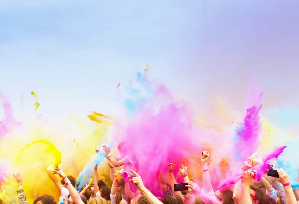
Tie-dye, mood rings, the Vibe 5K run; we live in a beautiful, multi-colored world, and it shows. How much thought do we give the difference in shades, though? The distinction between avocado green versus lime green doesn’t seem like much (at least, not until we’re mixing up some yummy guac). When it comes to graphic design color psychology, however, that minor distinction can have a huge impact.
Using graphic design color psychology, companies can paint powerful brand strategies for influencing customers. All it takes is discovering the color scheme that uniquely fits your company’s personality.
Looks like it’s time to break out the Pantone book! Here are a few ways graphic design color psychology can brighten your business and brand!
A Company’s Colorful Personality.
A brand color scheme can define a company’s personality. If you’ve seen Pixar’s Inside Out, you know exactly what we’re talking about. Each character was designed to portray a different emotion, their color scheme and physicality chosen to convey feelings even children could recognize. Anger is red hot, and fire rages from his head whenever his passion flares. Disgust’s grimace is matched with a nauseating green, and so on.
Companies can convey their own personalities with a well-chosen color scheme. Whole Foods highlights their healthy products by using a vibrant green, whereas Coca-Cola’s signature red has a bold impact.
If you’re considering a company brand redesign, strategizing with graphic design color psychology in mind can redefine your brand as well. Color combinations can elicit different emotional responses or draw the eyes to specific design elements, so it’s crucial to keep color in mind.
Designmantic’s 10 Commandments of Color Theory demonstrates the impact different color scheme strategies have on a logo. Considering your industry, buyers’ personas, and goals can influence your decision when choosing a color combination.
After all, a restaurant using a purple and neon green burger in their logo probably won’t entice your appetite successfully…Unless that sort of thing that gets your taste buds tingling. We’re gonna stick with our gauc in the meantime.
A Brand That Passes with Flying Colors.
If you really know your customers inside and out (see what we did there?), you can also use graphic design color psychology to empower brand loyalty and influence buying decisions.
A cohesive brand will feature your company’s color scheme across your logo, website, product packaging, and other materials. By strategically using the right color combination, you can trigger emotional responses and subliminally encourage customers to make a purchase (more on this below!).
The key is knowing your customers, their behavior, and their priorities are as they pass through the purchase funnel. Varying shades can create a sense of trust, authority, or sophistication, depending on your goals. As customers associate these emotional responses with your brand, they’ll choose your company above the rest.
After all, the McDonald’s classic golden arches have been a beloved burger beacon (not purple and green ones) since 1955. The cheerful, warm, and inviting color scheme conveys their brand and their industry with a promise of greasy goodness!
Color Outside the Lines for Conversions.
Whether you’re advertising through digital or print materials, your ads are designed to accomplish a goal. Your main objective may be increasing brand awareness, so you stick in the minds of customers the next time they need your product or service. Maybe your goal is to spark action in customers, instead. Regardless of your endgame, the right color strategy can get you there!
Whether your call-to-action (CTA) is a button on your website or phone number on your print materials, you want that graphic design element to stand out on the page.
Using a strategy such as the Isolation Effect—choosing a color for your CTA that stands out from the existing color scheme—is another useful method for attracting attention. As a result, you encourage potential customers to take action, simply by using a color that makes an impact.
Color Wheel Rationale.
Now that we’ve reviewed the importance of color psychology in graphic design, we can get to the real fun stuff: the colors themselves. Each “spoke” on the color wheel conveys its own meaning and emotion. Finding the right combination of colors to communicate your business is a powerful strategy for sparking brand interest and influencing customers.
Here’s your color wheel rationale cheat sheet, and a few companies who use these colors in their branding:
- Red – passion, love, bold (Examples: Coca-Cola, Target, Netflix)
- Orange – excitement, friendly, energy (Examples: Amazon, Fanta, Nickelodeon)
- Yellow – cheerful, warm, optimism (Examples: Bestbuy, Ikea, Subway)
- Green – soothing, healthy, growth (Examples: Animal Planet, Whole Foods, Spotify)
- Blue – calming, serene, trust (Examples: Facebook, Walmart, American Express)
- Purple – imaginative, royalty, wise (Examples: Welch’s, Hallmark, Syfy)
- Black & White – innocence, purity, balance (Examples: Apple, The New York Times, Nike)
With graphic design color psychology in mind, you can make informed decisions for your company’s brand. Ready to show off your true colors?

